RAY GAETA
UX Engineer in LA. Recent creative, product concept, and my Are.na. Book on my calendar, or

02
DESIGNDESIGN
Clients wanted branded experiences, so I shipped a shared component that passes stylesheets and intensity as props, allowing each partner to maintain their own visual identity without increasing technical maintenance.

Animation updates depended on code changes, preventing designers from quickly iterating on the look and feel. I built a no-code live editor that gave them direct control over styling, Bézier curves, and version history.
03
RESEARCHRESEARCH
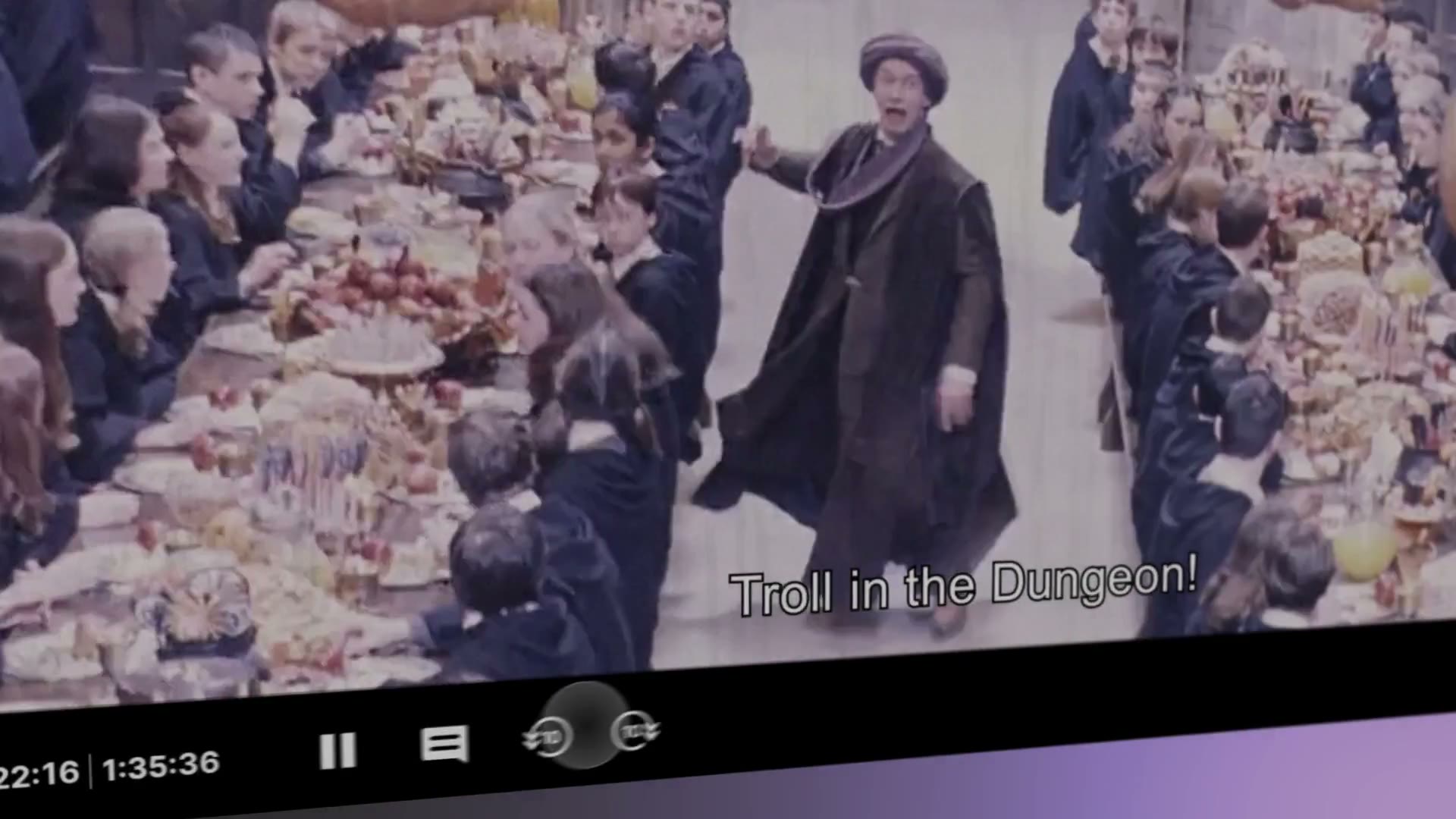
Expressive captions only work if they add comprehension. Our team ran two studies (346 hearing; 65+ Deaf and hard of hearing participants from the Berlin Deaf Community) to test whether we were helping viewers feel the scene, or just getting in the way of reading it.
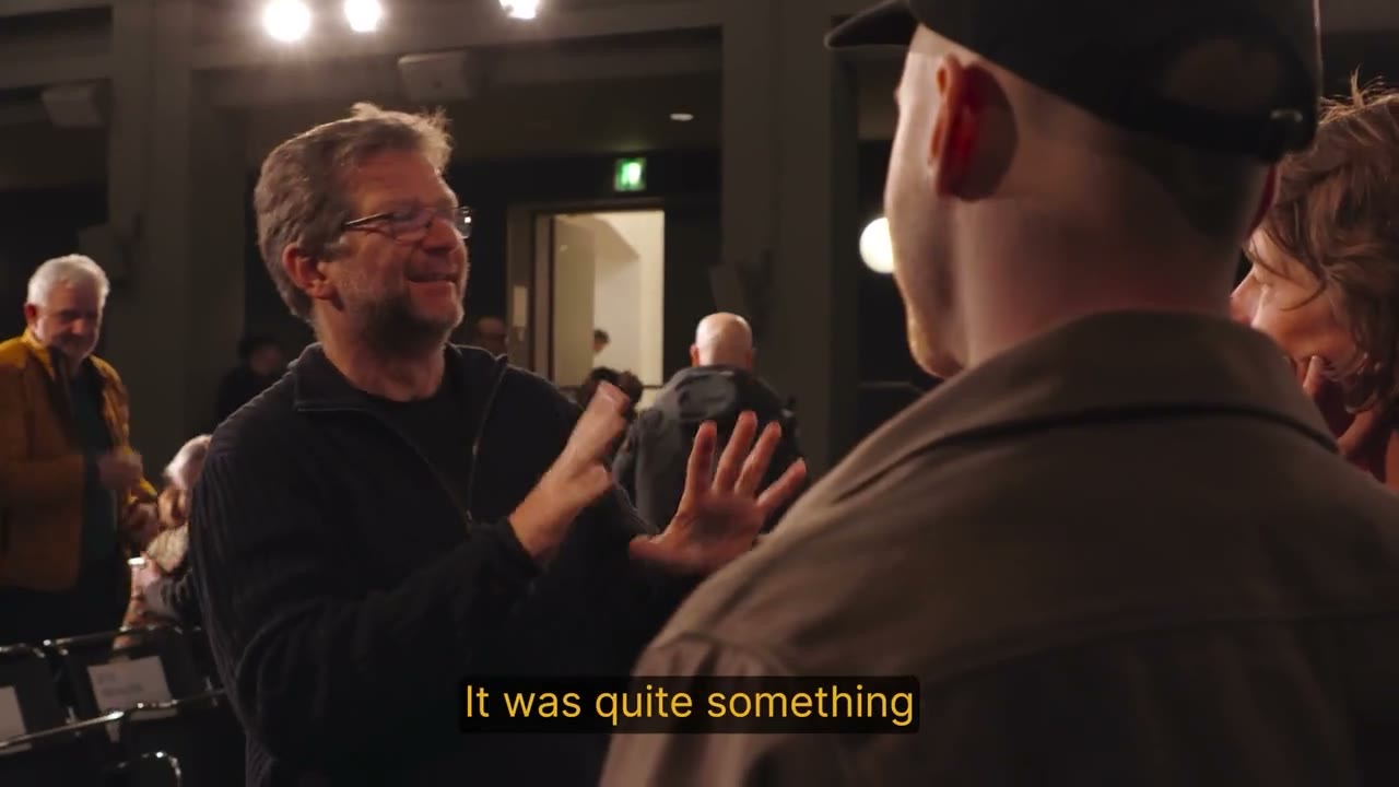
86.7% kept captions on with no comprehension penalty, and 81.9% wanted this on streaming platforms. The studies also showed +43% immersion, 89% emotion accuracy, +21% emotional clarity, and #1 adoption intent for movies and reels. Full write up on stage.phont.ai/research.
We combined these results with ASL feedback from international sign sessions to create a design system grounded in user preferences.

04
DISTRIBUTIONDISTRIBUTION
Developer teams wanted to launch in a few lines of code, so I bundled the expressive captions into a player agnostic NPM package (@phont-ai/subtitles and @phont-ai/subtitles-core). Flexibility was at the core of the module, supporting existing SRT and WebVTT workflows, content management systems, and the option to embed.

To improve conversion from discovery to adoption, the redesigned company site, developer documentation, and partner launch guides were deployed with analytics that revealed where teams dropped off.
05
EVENTSEVENTS
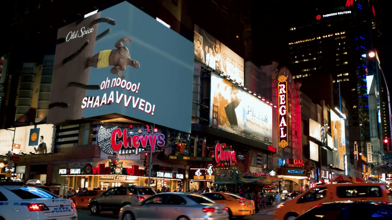
I represented PHONT at IBC, HPA, SXSW, and Academy sessions, gathering feedback from streaming executives, researchers, lawyers, and accessibility leaders.
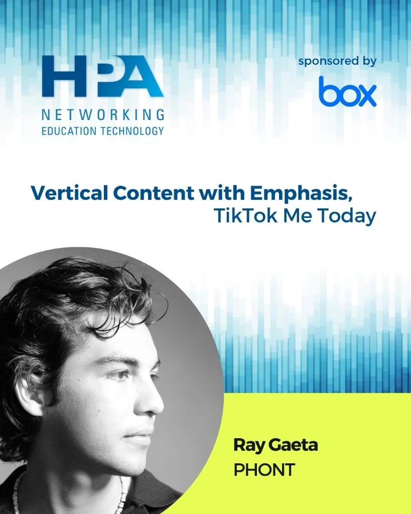
Discussions helped us prepare the product for real production environments, leading to pilots with Fortune 500 streaming platforms and an invitation to contribute to an Academy of Motion Picture Arts and Sciences executive meeting on the future of captions.


02
DESIGN SYSTEMSDESIGN
Each collection needed a distinct identity without fragmenting the user experience. We used color to differentiate sibling brands, while maintaining one global visual system and consistent interaction patterns for clear navigation.
03
WEB DEVELOPMENTWEB
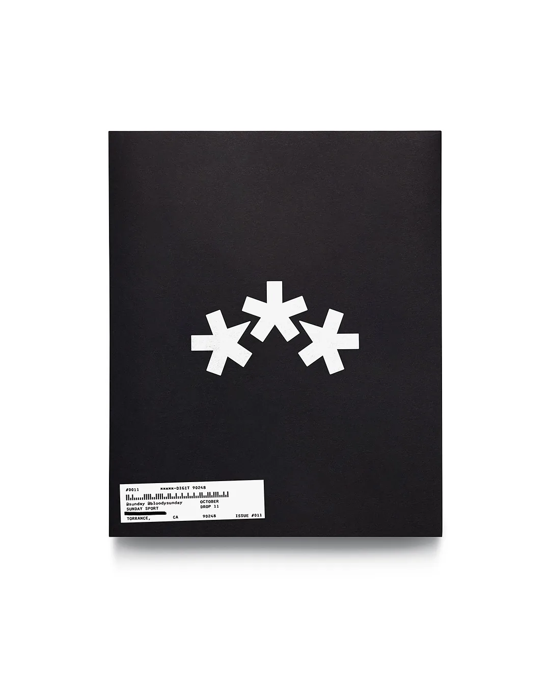
We designed the Sunday Yearbook as a digital collection for customers to join a graduating cohort. This turned each order into community participation, with an Honor Roll recognizing the studio's most active customers.
04
VISUAL CONSISTENCYCONSISTENCY
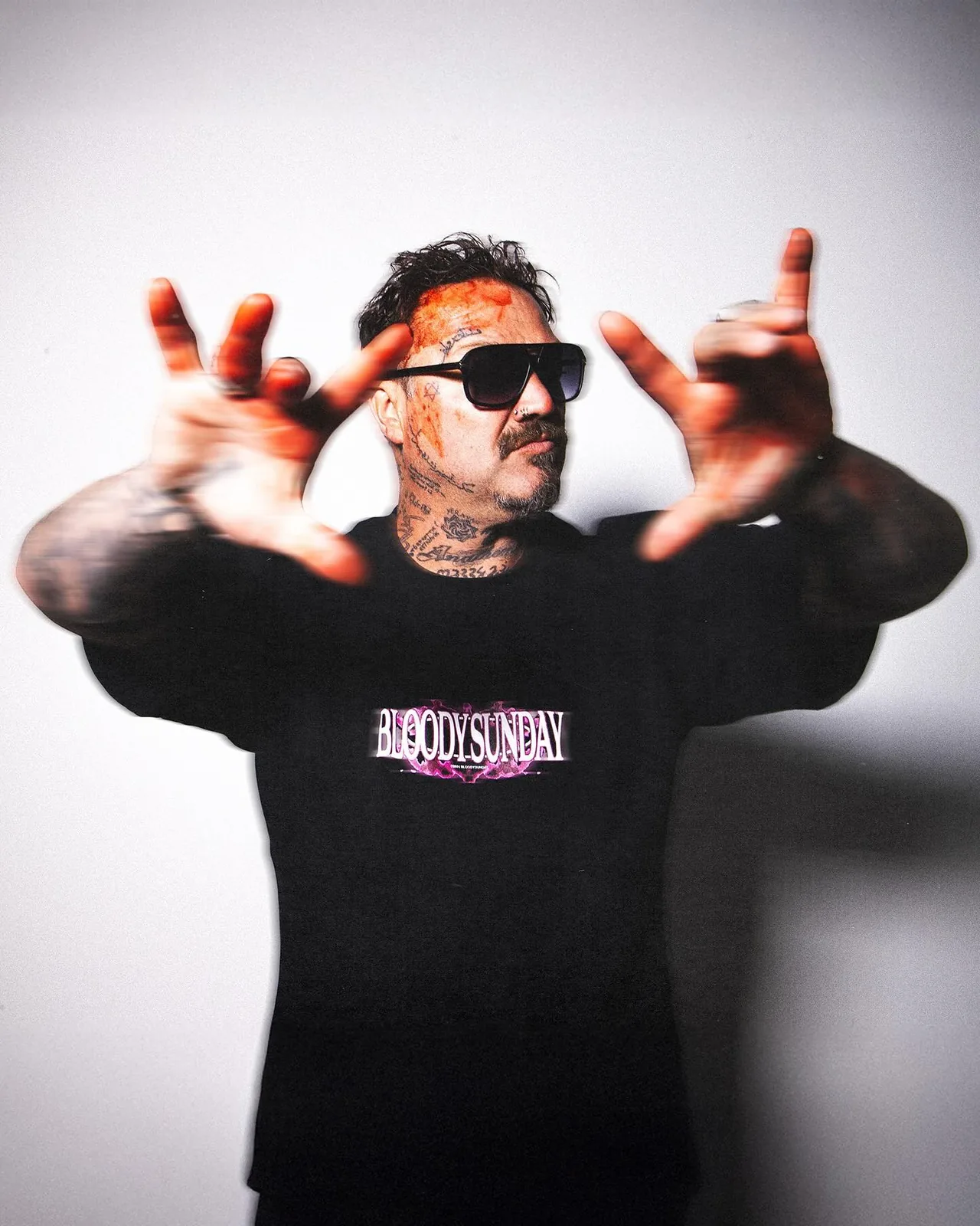
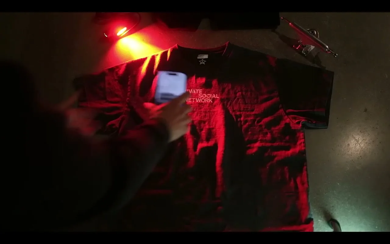
The visual identity was dispersed across product photography, social content, the website, and in-person activations. I helped align all touchpoints by grouping graphics, typography and palettes with a clear theme.

02
PRODUCTPRODUCT
The product experience was optimized for customer loyalty and aimed at encouraging a collector culture with long-term value.
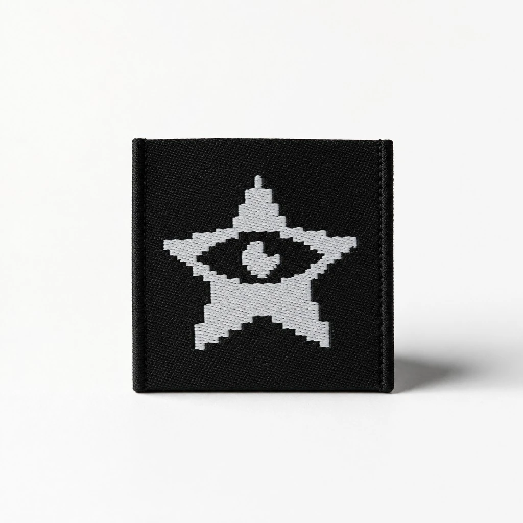
Products ship with a digital (NFC) member-chip that grants access to private events and content. To encourage a secondary market, the tag supports ownership transfer.
Every purchase is automatically added to the user's collection closet, where they can claim and refer other members for rewards.
03
WEB DEVELOPMENTWEB
Launched the storefront with a floating environment that presents one product at a time for an intuitive browsing experience that feels future retro.
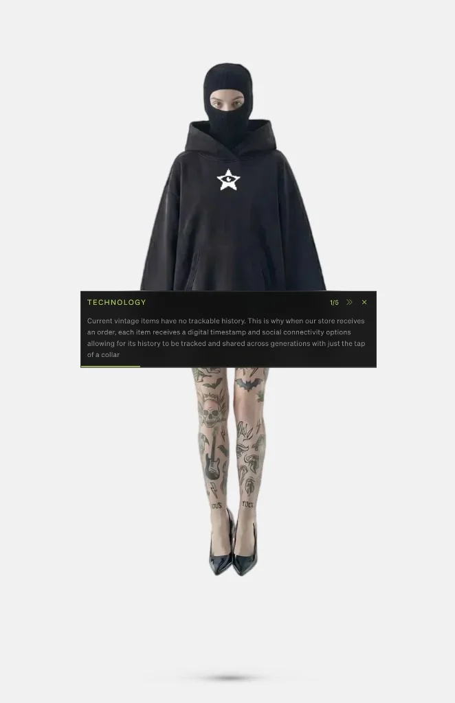
An interactive WebGL and Three.js scene supports the visual language with realistic lighting and shadows.
Unrounded corners and a vibrant lime accent, alongside the award winning font Soehne, communicate the brand's premium ethos.
04
CAMPAIGNCAMPAIGN
I spend my weekends documenting minibike culture through raw POV and photography. Minibikes: Bigger Than You Think is a collection of real testimonials exploring if it should become a sport.

I direct the visuals and write brand journals including Electronic Streetwear and 1,000 Member Milestone to build trust and exposure. In two months, the campaign generated 2M+ organic impressions and resulted in 1,800 members.